Updates NTP's Sponsored Images toggle functionality. #16895
Conversation
 github-actions
bot
added
the
CI/storybook-url
github-actions
bot
added
the
CI/storybook-url
|
A Storybook has been deployed to preview UI for the latest push |
There was a problem hiding this comment.
This looks good to me! But you might want to wait for reviews from @petemill or @fallaciousreasoning
| @@ -301,7 +302,10 @@ class NewTabPage extends React.Component<Props, State> { | |||
|
|
|||
| startRewards = () => { | |||
| const { rewardsState } = this.props.newTabData | |||
| if (!rewardsState.rewardsEnabled) { | |||
| if (!rewardsState.rewardsEnabled || | |||
| (rewardsState.externalWallet && | |||
There was a problem hiding this comment.
Optional nit:
| (rewardsState.externalWallet && | |
| rewardsState.externalWallet?.status === mojom.WalletStatus.kConnected |
| canSupportAds={!!this.props.newTabData.rewardsState.adsSupported}/> | ||
| canSupportAds={!!this.props.newTabData.rewardsState.adsSupported} | ||
| isExternalWalletConnected={ | ||
| !!this.props.newTabData.rewardsState.externalWallet && |
There was a problem hiding this comment.
Optional nit:
| !!this.props.newTabData.rewardsState.externalWallet && | |
| this.props.newTabData.rewardsState.externalWallet?.status !== mojom.WalletStatus.kNotConnected |
|
|
||
| import * as React from 'react' | ||
|
|
||
| export function SponsoredImageInfoIcon () { |
There was a problem hiding this comment.
Optional:
This doesn't need to be a functional component as it doesn't take any props, so you can just assign it to a constant:
const SponsoredImageInfoIcon = <svg ....> .... </svg>And then use it like this:
import SponsoredImageInfoIcon from '...'
// .
// .
// .
return <div>
     {SponsoredImageInfoIcon}
</div>
There was a problem hiding this comment.
Semi-related question: If we had a lot of components using this pattern in our codebase, does it negatively affect performance for sessions which don't result in uses of those components. Instead of exporting functions that don't get called, there would instead be a lot of React.createClass calls during initial JS module parsing. A single (or a few hundred??) instances of this of course won't matter, but it would be interesting to know if this is a best practice and at what point it causes negative impact.
| return getLocale('sponsoredImageOnDescription') | ||
| } | ||
|
|
||
| function GetDescriptionText (rewardsEnabled: boolean, |
There was a problem hiding this comment.
Nit: I think functions should be lower case (except for components) to fit in with most other stuff. This is pretty inconsistently enforced though (sorry)
| function GetDescriptionText (rewardsEnabled: boolean, | |
| function getDescriptionText (rewardsEnabled: boolean, |
| ` | ||
|
|
||
| export default function SponsoredImageToggle ({ onChange, onEnableRewards, checked, disabled, rewardsEnabled: rewardEnabled, adsEnabled, canSupportAds }: Props) { | ||
| const showRewardButton = checked && !disabled && (!rewardEnabled || (!adsEnabled && canSupportAds)) | ||
| function GetInfoTooltipText (checked: boolean, rewardsEnabled: boolean) { |
There was a problem hiding this comment.
Nit: I think functions should be lower case (except for components) to fit in with most other stuff. This is pretty inconsistently enforced though (sorry)
| function GetInfoTooltipText (checked: boolean, rewardsEnabled: boolean) { | |
| function getInfoTooltipText (checked: boolean, rewardsEnabled: boolean) { |
| return getLocale('sponsoredImageOnAdsOff') | ||
| } | ||
|
|
||
| function GetButtonText (rewardsEnabled: boolean, |
There was a problem hiding this comment.
Nit: I think functions should be lower case (except for components) to fit in with most other stuff. This is pretty inconsistently enforced though (sorry)
| function GetButtonText (rewardsEnabled: boolean, | |
| function getButtonText (rewardsEnabled: boolean, |
|
Thanks @fallaciousreasoning, all great points. Addressed in 23d9e1a |
|
A Storybook has been deployed to preview UI for the latest push |
 mkarolin
force-pushed
the
maxk-ntp-settings-si-toggle-update
branch
from
mkarolin
force-pushed
the
maxk-ntp-settings-si-toggle-update
branch
from
23d9e1a to
8330e4e
Compare
|
Squashed commits. |
|
A Storybook has been deployed to preview UI for the latest push |
| display: none; | ||
| } | ||
|
|
||
| &:hover .tooltip { |
There was a problem hiding this comment.
This won't show for non-mouse users. I think it could be pretty trivial to have the tooltip show when the icon is focused. Could you try?
| .tooltip { | ||
| position: absolute; | ||
| bottom: 100%; | ||
| left: -200px; |
There was a problem hiding this comment.
In RTL UI (which you can force and still keep english via chrome://flags), this is making the text get clipped
This could get fixed by the following (as I can't think of a better way right now!):
[dir=rtl] & {
  right: -200px;
}
Unfortunately that puts the arrow in the wrong place, so that also needs repositioning similarly.
There was a problem hiding this comment.
@petemill inset-inline-start seems to work for both directions. WDYT?
There was a problem hiding this comment.
@petemill It also looks like toggles' bullet doesn't move correctly to the ON position with RTL set.
|
A Storybook has been deployed to preview UI for the latest push |
|
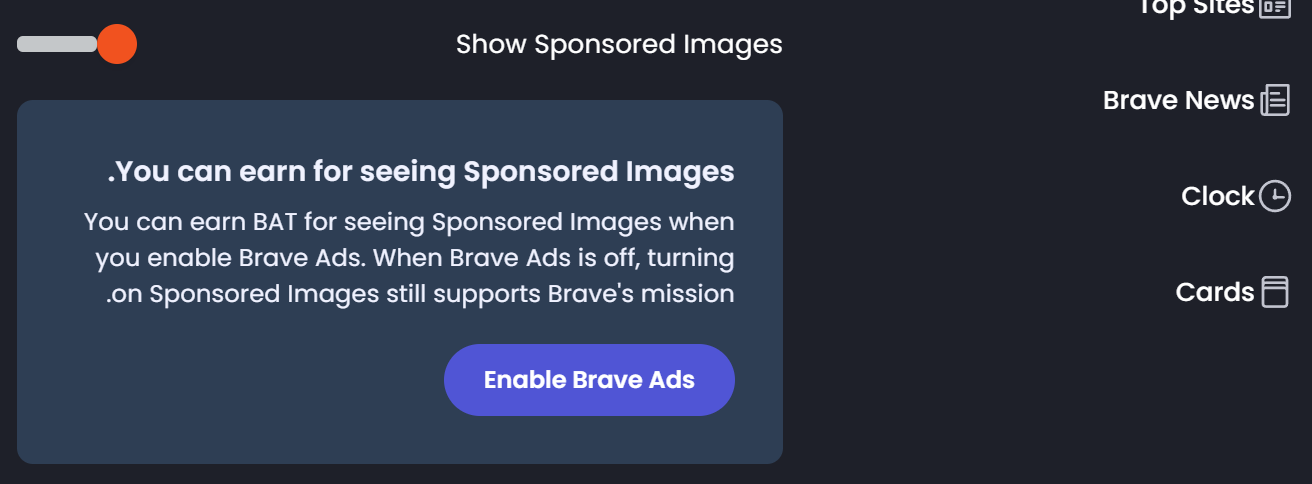
@petemill, could you, please, take another look. Thanks |
|
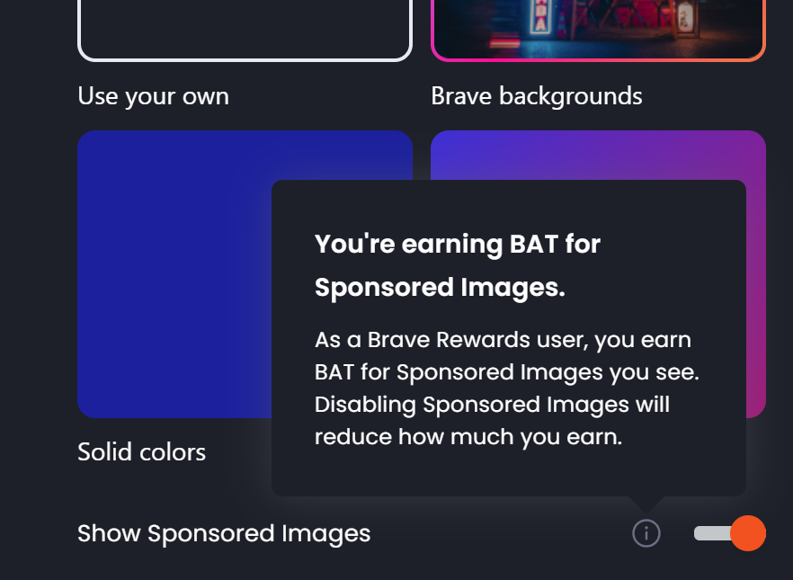
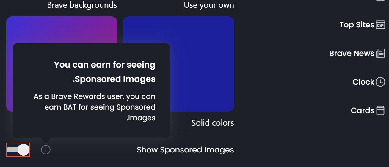
Updated screenshots:
|
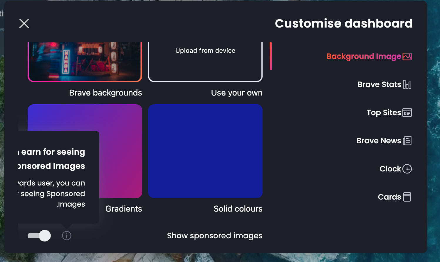
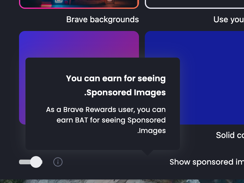
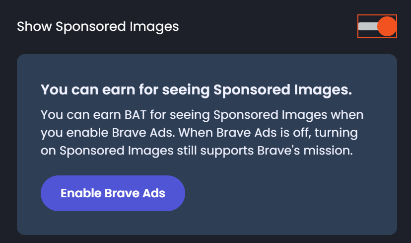
Resolves brave/brave-browser#27304
Submitter Checklist:
QA/YesorQA/No;release-notes/includeorrelease-notes/exclude;OS/...) to the associated issuenpm run test -- brave_browser_tests,npm run test -- brave_unit_testswikinpm run lint,npm run presubmitwiki,npm run gn_check,npm run tslintgit rebase master(if needed)Reviewer Checklist:
gnAfter-merge Checklist:
changes has landed on
Test Plan: