Themes issues #2410
Comments
|
I have defined some default variables for themes that does not have those, because before we were reusing some colors from the cyber theme. I am checking this now. |
4 tasks
Sign up for free
to join this conversation on GitHub.
Already have an account?
Sign in to comment
Describe the bug
There are elements in the interface that are always showing the color from the new default instead of the expected color from the there.
Game title in Zombie theme uses the mirage text color

(this light blue text color is leaking to a lot of places in many themes)
Same for the search bar

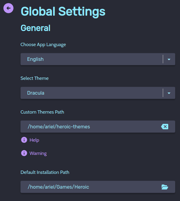
Also for Dracula

Game Defaults info message is too light in Nord Light:

Also Nord Light, current vs not current setting screen is too similar:

Dracula settings text color is the one from mirage
Same for some of the text in Zombie

Sweet accent color is too dark for the sidebar

Contrast of yellow button in Mirage is below standards:

Sync button in high contrast theme has bad contrast

These red buttons in high contrast theme have bad contrast when hovered

Same for Nord Light

Add logs
Steps to reproduce
Just try different themes
Expected behavior
Themes should have a consistent color palette. Elements should have at least AA contrast.
Screenshots
No response
Heroic Version
Latest Stable
System Information
Not relevant
Additional information
I don't know if this is the best place to report these issues, there are a lot of really small things.
The text was updated successfully, but these errors were encountered: